UWin Corporation, an IT training and certification company, approached Dinx Studio to rebuild its visual identity. Although the organization had strong expertise, the brand lacked clarity and consistency, failing to communicate professionalism and trust in the tech education space.Through detailed UX and UI research, we identified gaps in color, typography, and overall messaging that weakened recognition and credibility. Our goal was to create a unified system that represented precision, progress, and reliability.We introduced a modern logo, a refined blue and silver palette, and structured layouts applied across digital and print materials.
The result is a cohesive and future-ready brand that positions UWin Corp as a trusted name in IT education and professional development.
Scope of Project:
Brand Strategy – Brand Community Strategy – Research – UX/UI – Web Design – Branding and Identity Design – Identity System Design – Digital Marketing Assets – Video Production
The UWin Corp logo represents focus, precision, and continuous learning. The design draws inspiration from the idea of “framing perspective,” symbolized by the two hands forming an L-shape—bringing clarity and focus to every IT professional’s growth journey. The mark embodies discipline and innovation, reflecting UWin Corp’s mission to help professionals sharpen their skills and excel in a rapidly evolving digital landscape.
Across all platforms, the UWin Corp logo integrates seamlessly with visual assets. Whether on digital banners, course thumbnails, or printed materials, strict adherence to spacing, contrast, and sizing ensures brand consistency. The logo’s clean geometry complements both photographic and vector-based imagery, reinforcing the identity of a credible and modern training provider.
The logo system was presented in multiple formats suitable for both digital and print environments. Its adaptability ensures visibility and recognition across email signatures, presentation decks, social media banners, and e-learning dashboards—an essential asset for a professional training company operating across diverse digital touchpoints.
Rooted in cool blues and sharp aquas, the color system conveys trust, intelligence, and progress—qualities synonymous with professional excellence in the tech sector. Complemented by gradients of steel gray and soft white, the palette evokes a sense of stability and clarity, aligning with the brand’s commitment to transparent, high-quality training experiences for organizations and individuals alike.
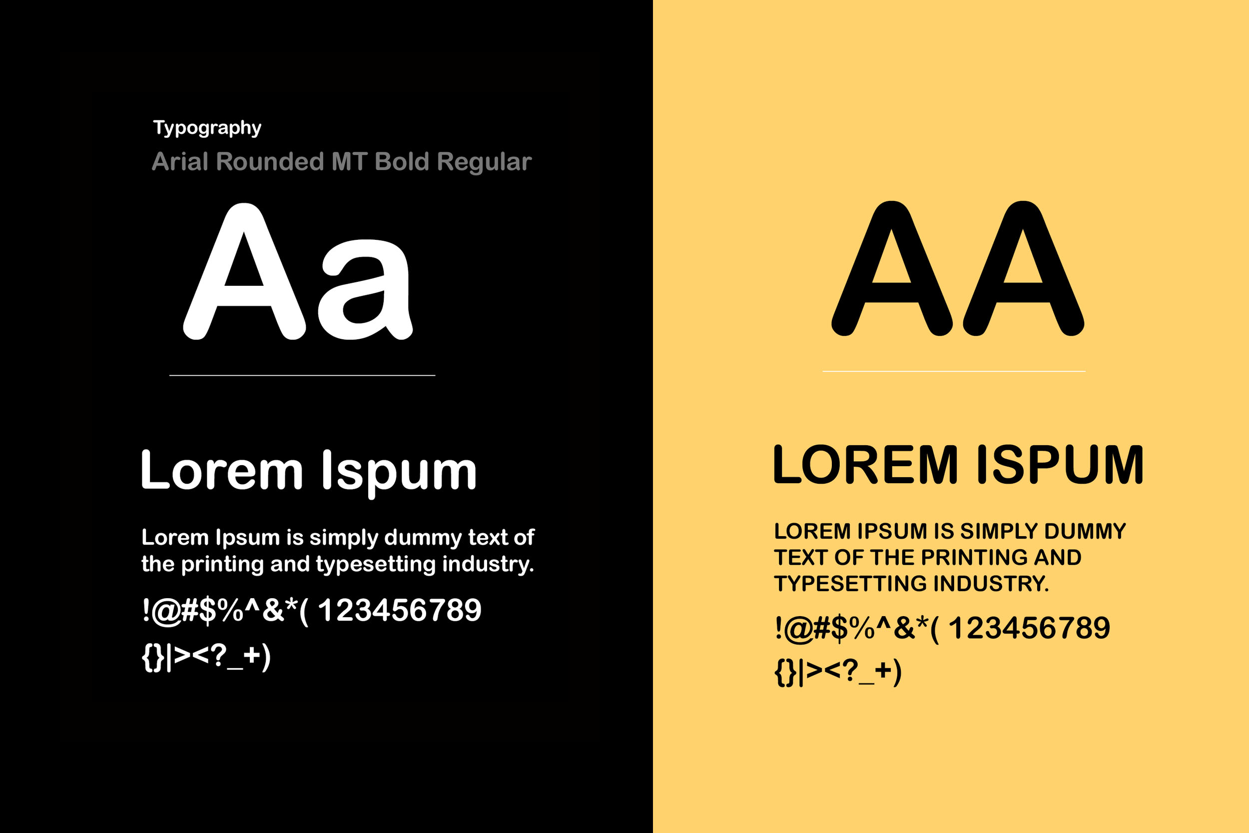
Clean, contemporary sans-serif typography was chosen to express professionalism, clarity, and approachability. Its geometric precision mirrors the structure and consistency of the IT industry, while balanced spacing ensures effortless readability across digital and print platforms, reinforcing UWin Corp’s modern and accessible brand identity.
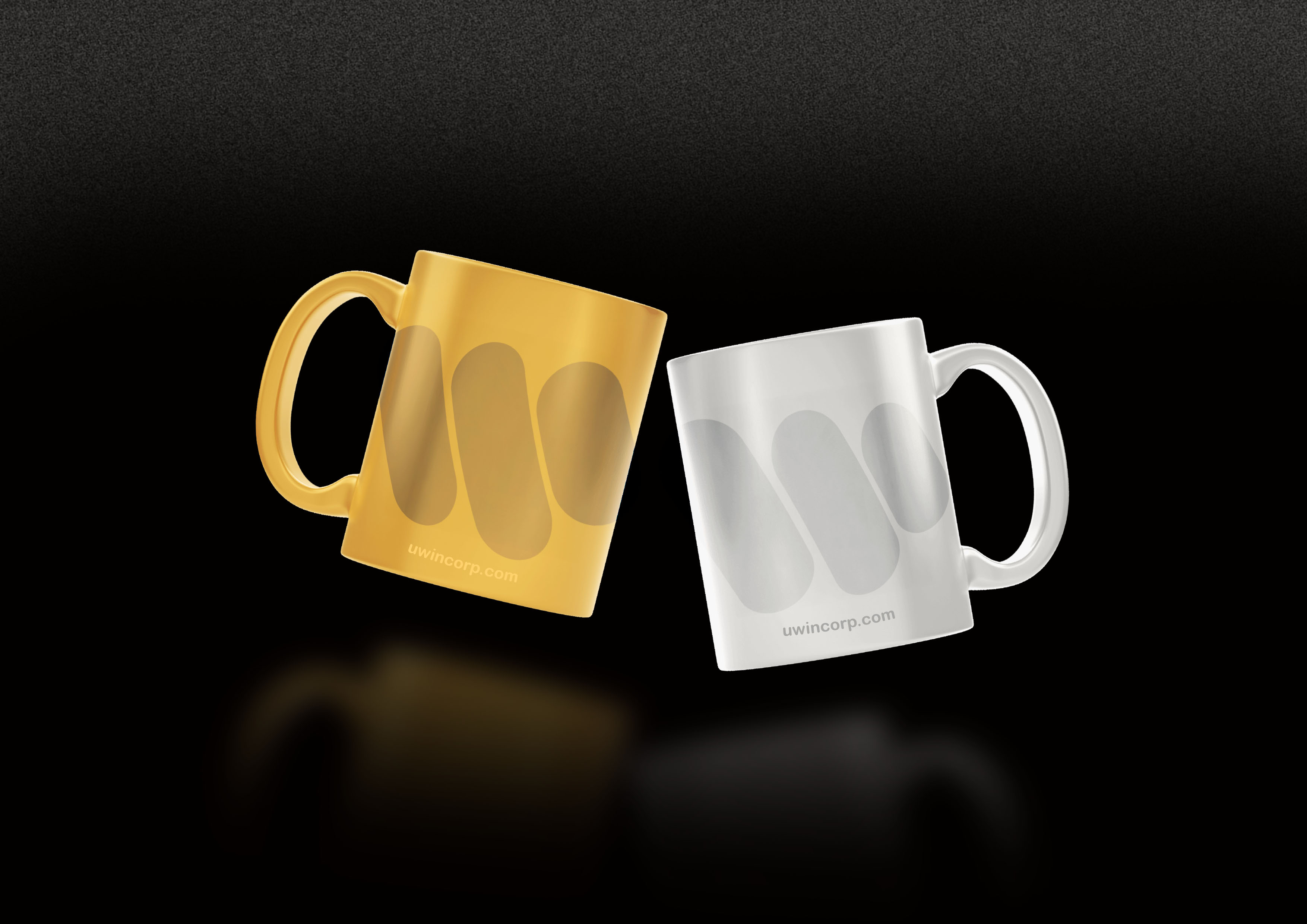
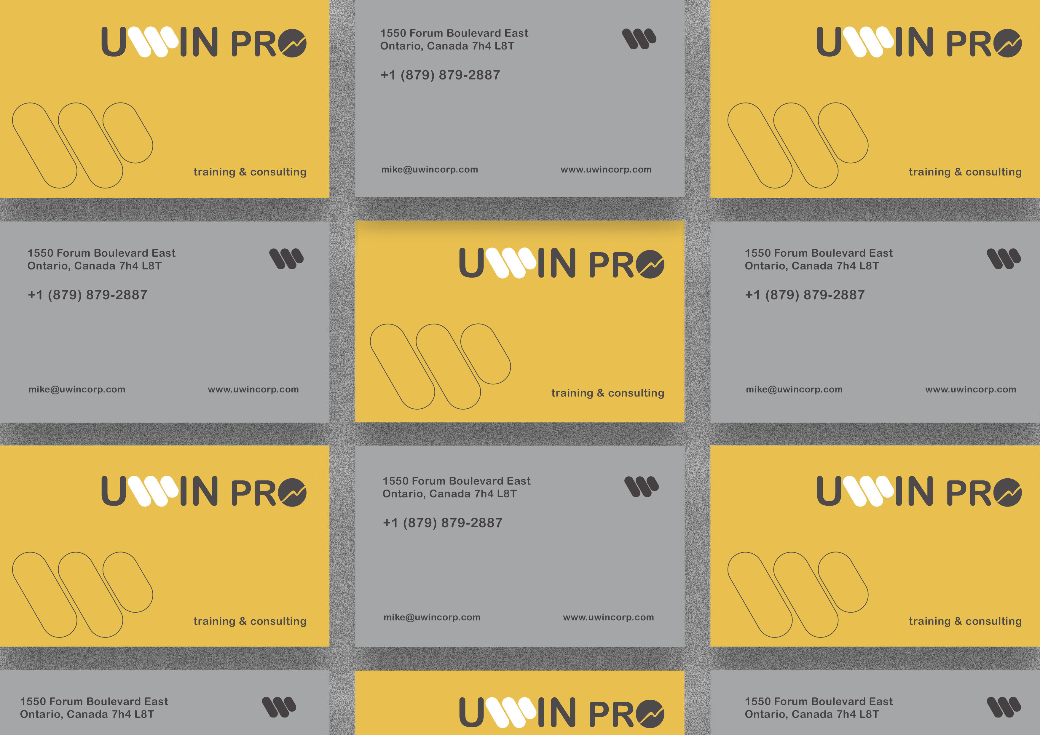
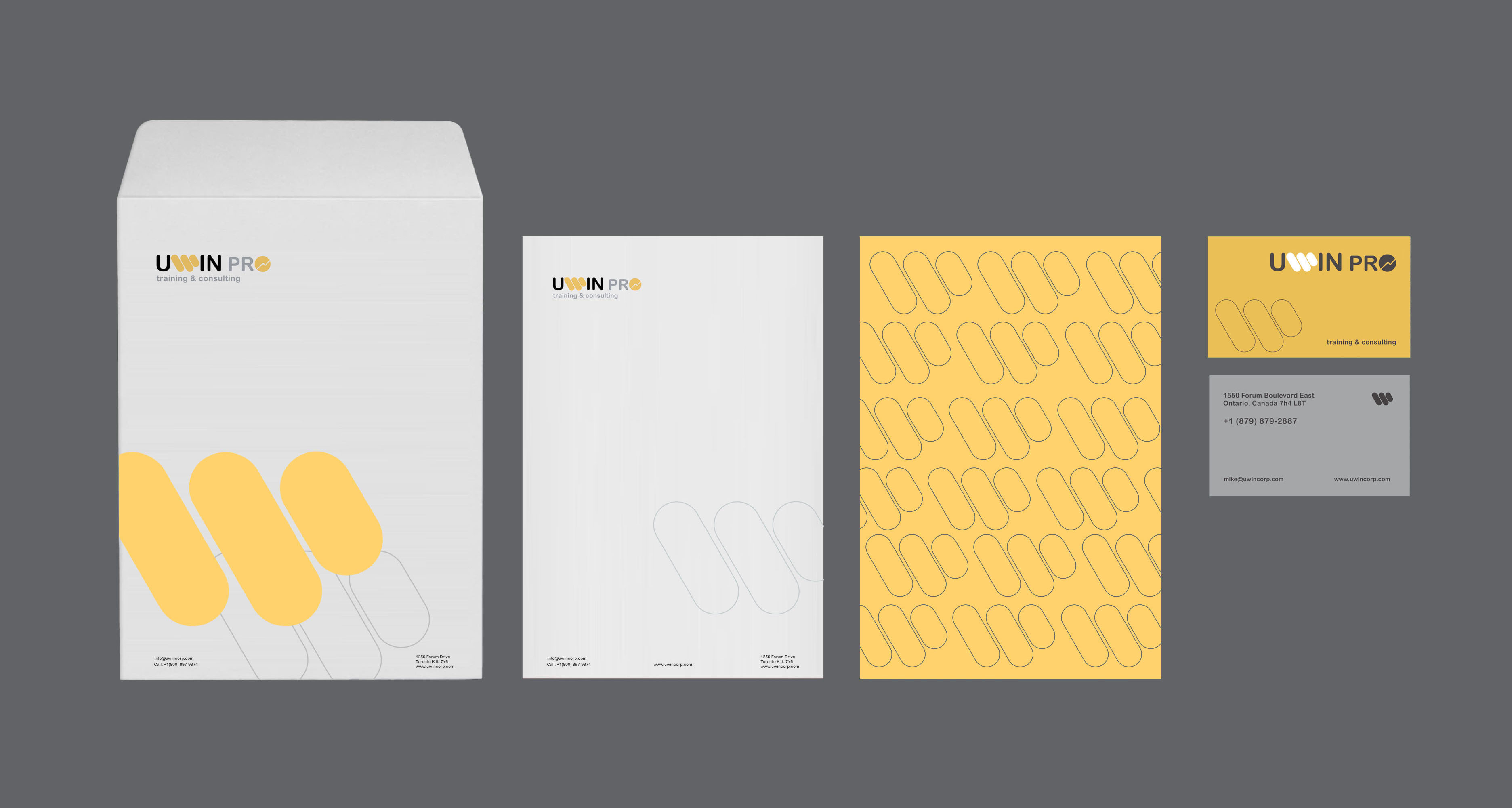
The UWin Corp brand was crafted to reflect leadership, innovation, and precision within the corporate IT training industry. Its identity merges professionalism with modern simplicity, creating a visual language that communicates trust and progress. Implementation across digital and print platforms—from websites and learning dashboards to certificates and promotional materials—was handled with consistency, ensuring a unified tone and experience. Collateral such as stationery, course catalogs, and presentation decks follow a clean and structured layout, reinforcing credibility and brand integrity. The merchandising strategy further extended this identity through premium-branded materials like notebooks, apparel, and accessories, enhancing brand recall and fostering a sense of belonging among professionals who engage with UWin Corp’s programs.
UWin Corp’s marketing and branding strategies were built around positioning the company as a trusted leader in corporate IT training and professional development. The focus was on clarity, credibility, and digital engagement—ensuring every visual and message reinforced the company’s commitment to empowering IT professionals. Through targeted campaigns, data-driven advertising, and consistent brand storytelling, UWin Corp connects with both individual learners and enterprise clients. The branding approach emphasizes modern design, intelligent use of color, and strategic messaging to communicate growth, innovation, and expertise, establishing UWin Corp as a forward-thinking brand in the technology education sector.
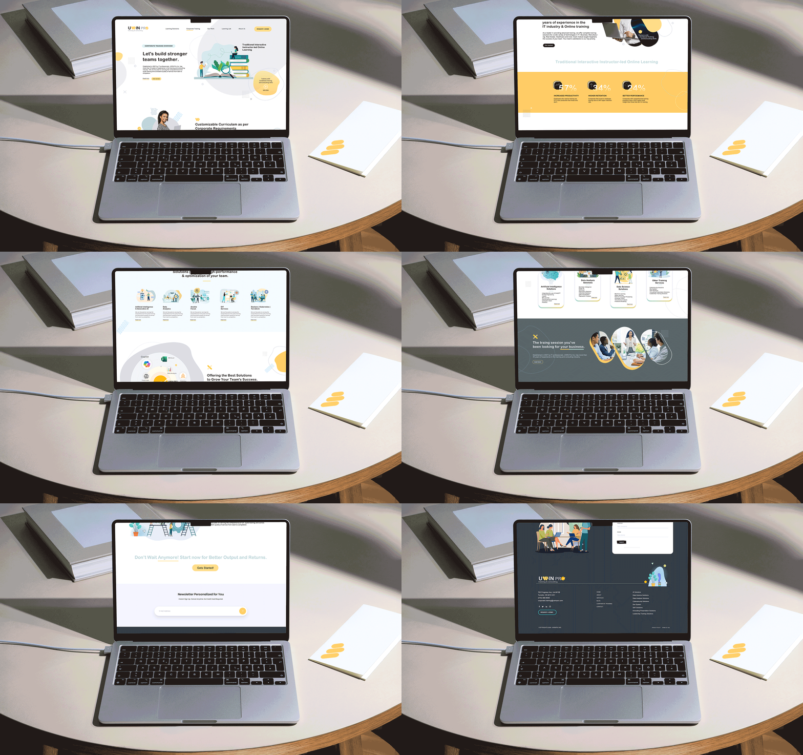
The website was optimized for flawless performance across all devices—from desktops in corporate offices to mobile screens used by on-the-go professionals. Adaptive layouts, scalable typography, and optimized media ensure that every user experiences consistent clarity and usability, reinforcing UWin Corp’s forward-thinking digital standards.
Every web section was custom-built to reflect the professionalism and structure of UWin Corp’s training programs. Modular layouts, interactive icons, and animated elements were used to emphasize engagement and accessibility. From course overviews to testimonial displays, each part was crafted to communicate clarity, trust, and corporate credibility.
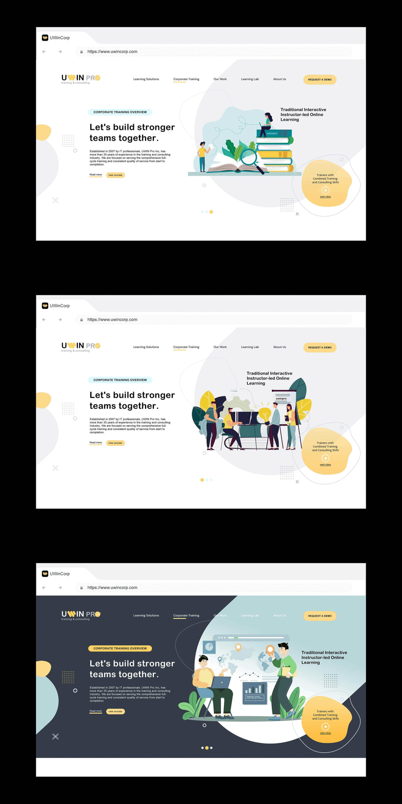
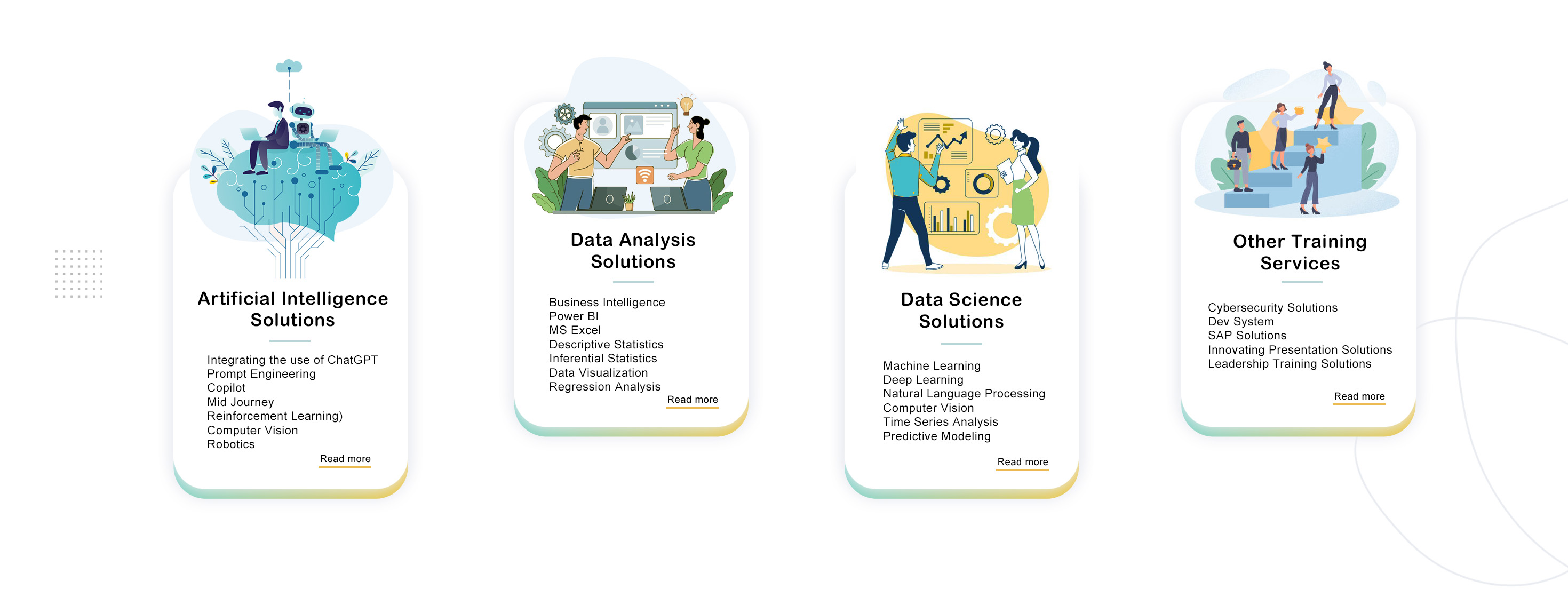
Each service category on the UWin Corp website features a custom-designed header that visually represents its area of expertise—ranging from corporate IT training and certification programs to consulting and upskilling solutions. These headers establish a cohesive yet distinctive visual identity, helping visitors quickly recognize and navigate the services most relevant to their professional development goals.
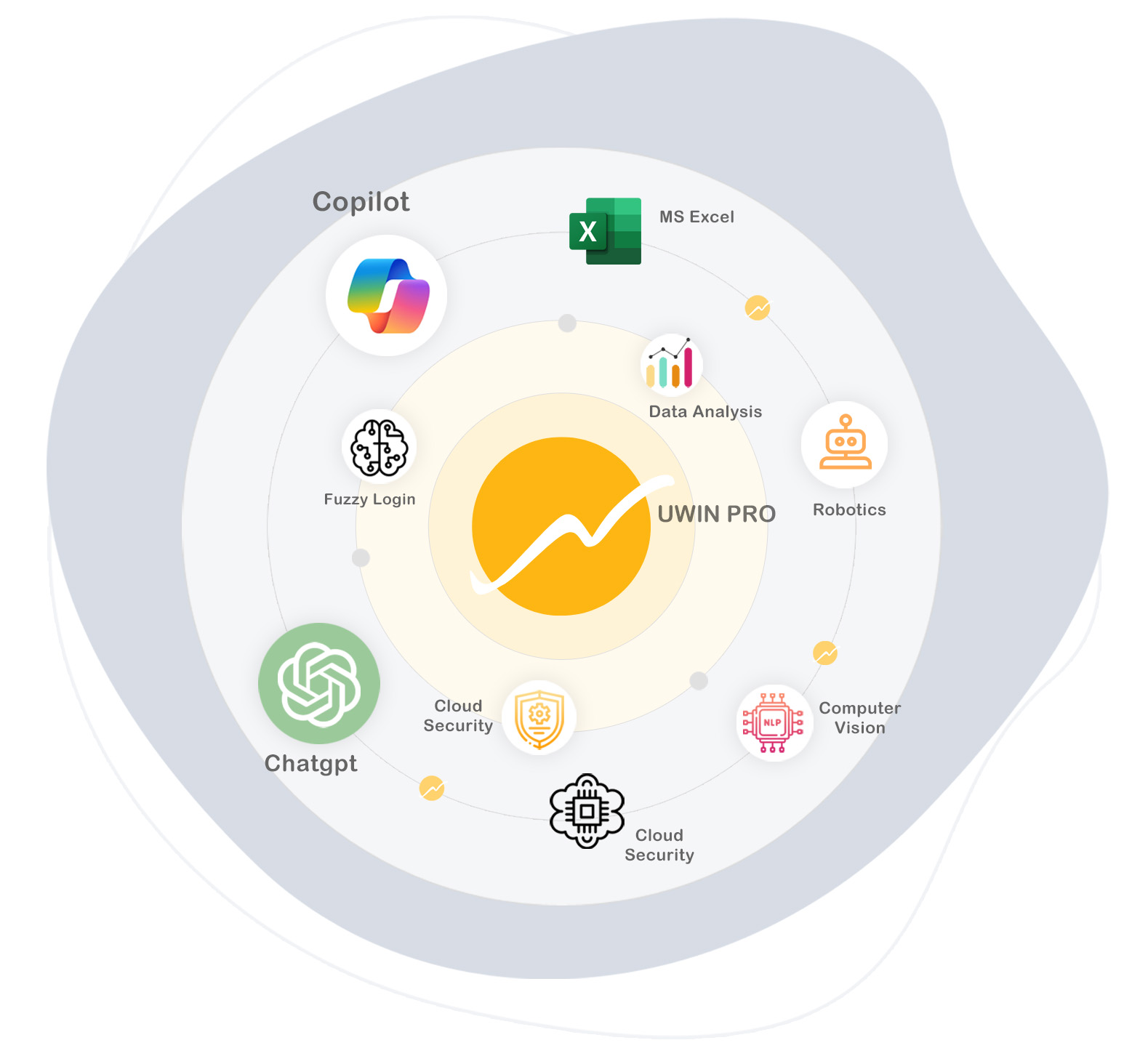
Custom infographics and design systems were developed to visually communicate UWin Corp’s structured approach to IT training and professional development. The infographics simplify complex technical concepts into clear, engaging visuals, using consistent grids, iconography, and brand color logic. Complementing this, the design system establishes a unified visual framework across all digital and print platforms—ensuring consistency in typography, spacing, and UI components. Together, they create a cohesive and scalable visual language that enhances comprehension, strengthens brand recognition, and supports UWin Corp’s mission to deliver clarity and innovation in corporate IT education.
Custom headers were created for UWin Corp’s sections and pages to establish clear visual hierarchy and intuitive navigation across the website. Each header was strategically designed to represent its respective service area—such as IT certification, corporate training, consulting, or skill development—using brand colors, iconography, and structured typography. The design maintains consistency through predefined grid systems and spacing rules from UWin Corp’s design system, ensuring visual balance and adaptability across all screen sizes. These custom headers not only strengthen brand identity but also guide users effortlessly through content, enhancing clarity and engagement throughout the browsing experience.